Dual Axis Viewlet
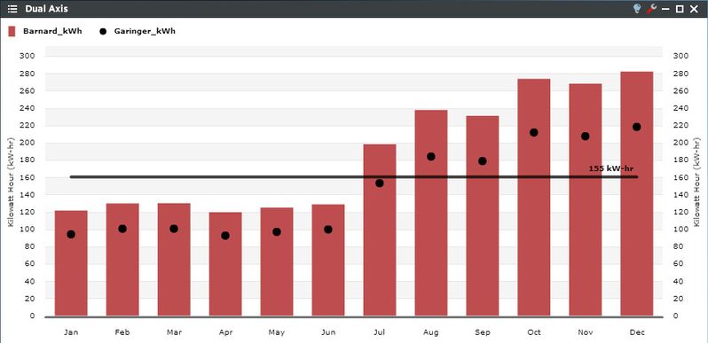
The Dual Axis Viewlet allows a user to visually evaluate the relationship between two or more historic variables through the ability to chart two different types of trends on separate Y-axes. This feature can be used for making comparisons between similar or different variables over a common time frame, as correlations in profiles are easily identifiable.
Smart Chart Drilldown
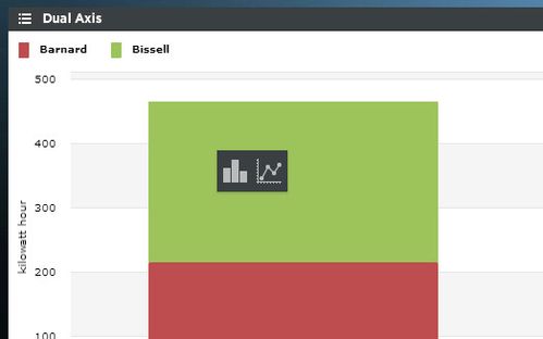
Clicking on the individual trends in the Viewlet will open up a smart chart drilldown menu. Clicking on the graph type will open up a new Dual Axis Viewlet of that specific trend, as either a column or line chart. The newly created smart chart drilldown will intelligently display the data in more granular increments based upon the original time period setup of the Dual Axis Viewlet. For example, if looking at monthly data, the drilldown will show the daily values for the month selected; if showing daily data, the drilldown will show hourly increments for the day that you drilldown into, etc. If you're displaying a "rolled up" trend that was created in Periscope config, you'll have four total options for smart chart drilldowns: The two seen in the screenshot above to look at the individual trend in more granular increments, and two more options to display all of the individual (child) trends that were added together to create the rollup.
Dual Axis Configuration
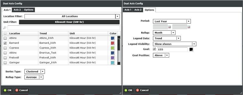
Trends:
There are three tabs in the Dual Axis Viewlet’s configuration menu. The first two are for filtering trends by unit and selecting which variables which will be on each Y-axis. Users can select multiple trends for each axis, as long as the trends displayed on their respective axis are all the same unit. You can select multiple trends by filtering Locations or Units, or both. Additionally you can start typing in the trend name in the search box to narrow down the search field. The units are dictated by the global properties inside Periscope Config. If you don't like the default color, you can change it via the color boxes on the far right.
- Series Type: Select the style of how the graph is displayed. Select Clustered, Stacked, Line, or Bubble.
- Rollup: Select Avg, Min, Max, or Sum values of trends based on selected date ranges.
Options:
- Period: Select the time span shown for the selected trends. Selecting 'Time Range' will allow for using the calendar boxes below.
- Rollup: Select Avg, Min, Max, Sum values of trends based on selected date ranges.
- Legend Data: Show the Location, Trend, or both labels on the top left of the viewlet.
- Legend Visibility: Show always, never, or only when the viewlet is maximized.
- Goal: Draws a line across the graph to signify a target. The color can be changed by clicking on the box to the right.
- Goal Position: Draws the line either above or below the bars.
The 2nd axis (if used) will be drawn second causing it to be the top-most series. For this reason it's often better to use columns on the first axis and line or bubble on the second axis.