Utility Performance Index Viewlet
The Utility Performance Index (previously Scatter Plot) provides a “KPI-style” visualization of Utility Usage versus efficiency for multiple locations, and is an excellent way to identify and prioritize opportunities for improvement in energy efficiency among all the buildings in a campus or enterprise.
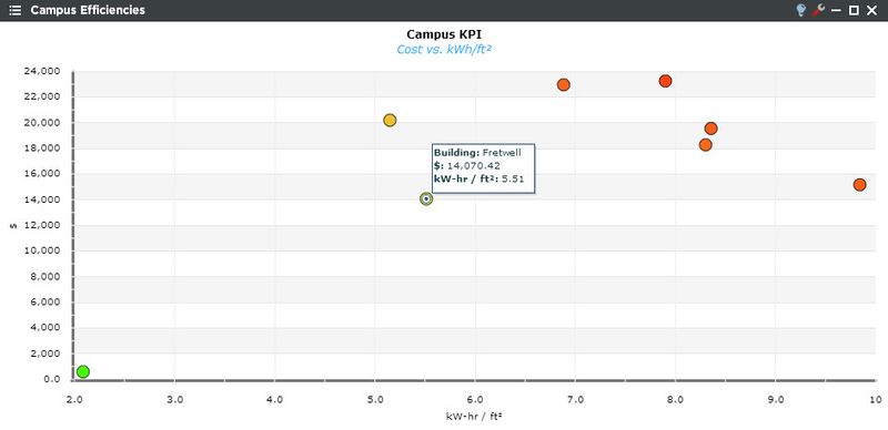
The user should desire their locations to be located in the lower, left quadrant of the plot. Problem spots are located towards the top of the graph, especially in the red section. Mousing over the locations gives the user more detailed information on the facility’s usage numbers.
Utility Performance Configuration
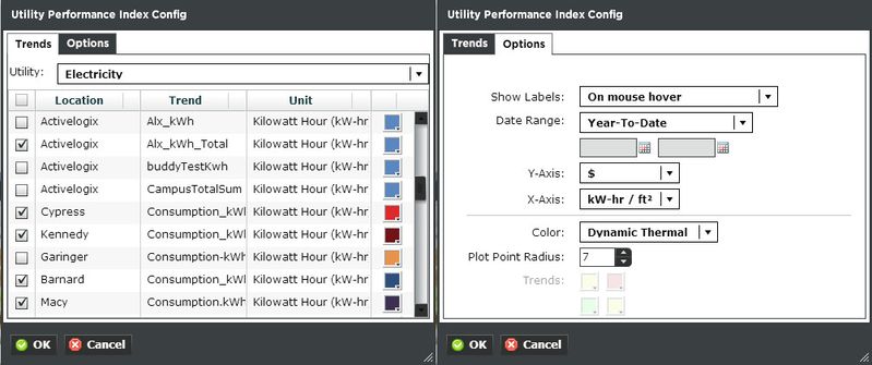
Trends:
You can select multiple utility trends such as electricity, gas, sewer, and water. The Units are dictated by the global properties inside Periscope Config. If you don't like the default color, you can change it via the color boxes on the far right.
Options:
- Show Labels: Sets the location names on the graph. Chose to show always, on mouse hover, or only when maximized.
- Date Range: Select the time span shown for the selected trends. Selecting 'Time Range' will allow for using the calendar boxes below.
- Y & X Axis: Users can customize axes between usage, usage/sqft, cost, and cost/sqft.
- Color: None sets the points to be the color they are set in the trends tab. Dynamic thermal will show the points in a green to red gradient (shown at the top of the page). Quadrant will set the background into 4 color segments of the users choice.
- Plot Point Radius: Sets the size of the points on the graph.
- Trends: Becomes available to select colors when the color option is set to quadrant.