Cross Correlation Viewlet
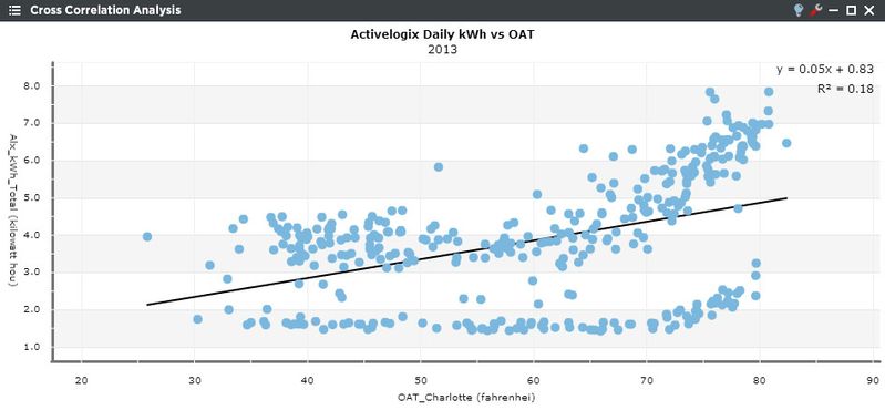
The Cross Correlation Analysis viewlet shows various kinds of correlations between variables with a certain confidence interval. This viewlet uses linear regression analysis to provide actual correlation values. If the pattern of dots slopes from lower left to upper right, it suggests a positive correlation between the variables being studied. If the pattern of dots slopes from upper left to lower right, it suggests a negative correlation. A line of best fit (alternatively called 'trendline') can be drawn in order to study the correlation between the variables. If the best fit line is enabled in the configuration, a slope-intercept formula will be displayed in the top right. R2 is the coefficient of determination, that is R2 indicates how well data will fit in a statistical model. In addition, an identity line, i.e., a y=x line, or an 1:1 line, is often drawn as a reference. The more the two data sets agree, the more the scatters tend to concentrate in the vicinity of the identity line; if the two data sets are numerically identical, the scatters fall on the identity line exactly. If desired, stray points can be removed from the linear regression calculation by clicking on them.
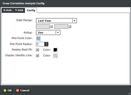
Cross Correlation Analysis Configuration
X & Y Axis:
On the Trend tab, the user can select the trend they wish to display. Filter through multiple trends by selecting Locations or Units, or both. Additionally you can start typing in the trend name in the search box to narrow down the search field. Use the X-Axis tab to select the variable of interest, such as “Main Power (kWh)” and Roll-up type, such as Avg, Min, Max or Sum. Use the Y-Axis tab to select the cross correlation variable such as “Outside Air Temperature” and Roll-up type, such as Avg, Min, Max or Sum.
Config:
- Date Range: Select the time span shown for the selected trends. Selecting 'Time Range' will allow for using the calendar boxes below.
- Rollup: Select a range of rollup data that will be displayed.
- Plot Point Color: Select the color of the points displayed on the graph.
- Plot Point Radius: Determines the size of the points on the graph.
- Display Best Fit: The average line that is drawn across the plot. Select a custom color as well.
- Display Identity Line: The Identity line is often used as a reference in a 2-dimensional scatter plot comparing two sets of data expected to be identical under ideal conditions. Select a custom color as well.