Ranking Chart Viewlet
The Ranking Chart Viewlet allows the user to make instant side-by-side comparisons between historical data sets of a given variable. The Ranking Chart enables the user to display data in a columnar fashion for one variable (for example kWh), ranked in either increasing or decreasing order. Values can be normalized by square footage for more accurate comparisons. The Ranking Chart can also be adjusted to rank Energy Star scores if you're using the Energy Star Driver to integrate to Portfolio Manager. Read more about that feature here.
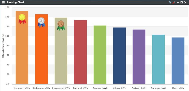
The Ranking Chart Viewlet is an appropriate tool for making quick and easy assumptions about energy usage between facilities.
Smart Chart Drilldown
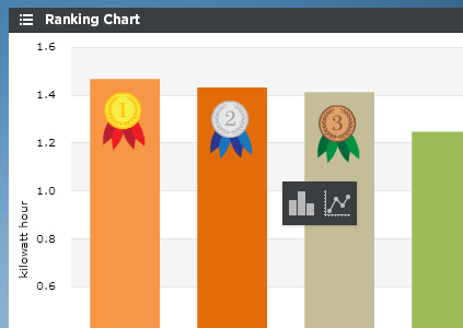
Clicking on the individual trends will open up a smart chart drilldown menu. Clicking on the graph type will open up a new Dual Axis viewlet of that specific trend.
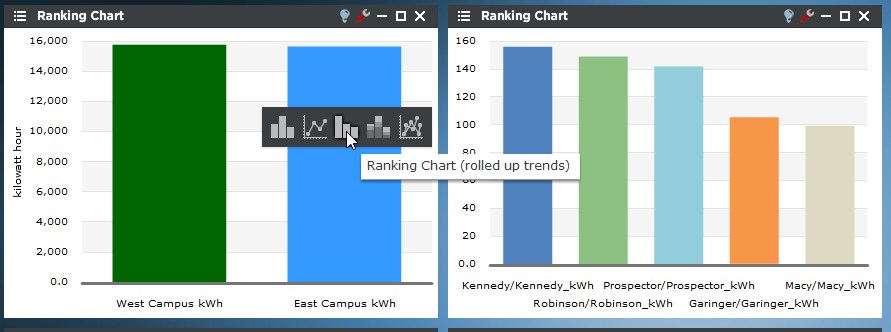
If there are rolled up trends being shown in the Ranking Chart, the user can drill down into the trend hierarchy instead of always drilling down into the time range like above. This feature can only be used with rolled up trends (ones created in PersicopeConfig using the "rollup" feature). For example, in the screenshot below the "East" trend is a rolled up trend consisting of Fretwell, Garinger and Kennedy. When clicked it presents several new options to further drill into the data. The new options are:
- Ranking - Creates a new Ranking Chart with all children trends (only available in Ranking Charts)
- Stacked Column - Creates a new column chart with stacked columns
- Multi-Line - Creates a new Line Chart
Ranking Chart Configuration
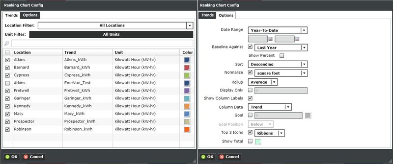
Trends:
You can select multiple trends by filtering Locations or Units, or both. Additionally you can start typing in the trend name in the search box to narrow down the search field. The Units are dictated by the global properties inside Periscope Config If you don't like the default color, you can change it via the color boxes on the far right.
Options:
- Date Range: Select the time span shown for the selected trends. Selecting 'Time Range' will allow for using the calendar boxes below.
- Baseline Against: Checking this box will compare the values of the trends with their values or percentage of a previous period.
- Sort: Ascending or Descending
- Normalize: Compares trend values based on relative floor sizes. This can be adjusted to sq ft, or sq meter in the global properties setting of Periscope Config.
- Rollup: Select Avg, Min, Max, Sum values of trends based on selected date ranges.
- Display Only: Display the a specific number of trends based on the sort order.
- Show Column Labels: Paints the value of the individual trend on the graph itself.
- Column Data: Show the Location, Trend, or both labels under the individual trends. Note: if there are multiple trends that have the same location, Location/Trend will be displayed instead.
- Goal: Draws a line across the graph to signify a target.
- Goal Position: Draws the line either above or below the bars.
- Top 3 Icons: For the top 3 performers, show a ribbon or trophy icon.
- Show Total: An additional bar that shows the total value of all the trends. A unique color can be selected for this value.