Drilldown Column Chart Viewlet
 : This Viewlet requires additional Niagara AX setup/configuration. Contact your distributor or Activelogix for details.
The Drilldown Column Chart Viewlet has the same functionality as the normal Column Chart Viewlet, with the benefit of being multi-tiered. By clicking on specific columns, the user can “drill down” to levels contained within the one above it. The groups beneath each section are constantly totaled, relative size at all times. Specific values can be seen by hovering over the individual columns. This viewlet can be helpful for comparing multiple levels of data, such as a business park, its buildings, wings, rooms, etc.
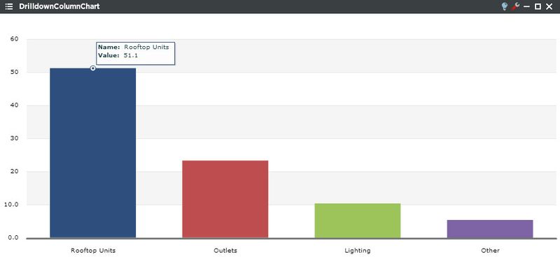
The chart can have as many levels as the user creates. A double-click drills down, while the button in the upper-left corner navigates the user up one tier
Drilldown Column Chart Setup in Niagara
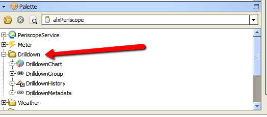
- Locate the alxPeriscope.jar file search for the Drilldown Folder.
- Create a unique drilldown folder in the station's config.
- Start building out your file structure from objects in the Drilldown folder of the alxPeriscope module in the Palette window to your newly created folder.
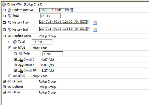
Below is an example of the Office kWh Drilldown created for the above viewlet in Niagara. The main element of a chart is the RollupChart object. This object can contain any number of nested RollupGroup and NumericPoint objects. The Update Interval property is used to adjust how often this object totalizes the different levels of information. This should be no quicker than your point update interval and can be reduced to save processing power.
Once this is created, the user just needs to 'map' it in the Numeric Points tab of Periscope Config. A point name will then become available in the Point tab of the Drilldown Pie Chart config. The created chart will then be applicable to both types of Drilldown viewlets.
Drilldown Column Chart Configuration
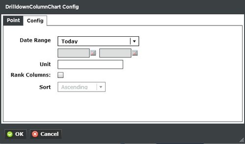
Config:
- Date Range: Select the time span shown for the selected trends. Selecting 'Time Range' will allow for using the calendar boxes below.
- Unit: This is essentially a label for the Y-axis.
- Rank Columns: Checking this box will make Sort available to arrange the graph in ascending or descending format.