Demand Duration Viewlet
The Demand Duration Viewlet displays the amount of time a given variable has exceeded a specific value. The user will often look to eliminate peak values on the left side of the graph that only occur a minimal portion of the time. For instance, if kW demand spikes for 4 hours per month, the user may determine that a simple demand limit algorithm can prevent that peak from happening. The viewlet could also be used to determine how many hours per month a room temperature is above a specific point.
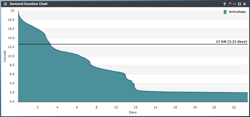
This example shows a high level of energy consumption, as indicated by the large portion of area under the left side of the graph. “Mousing” over the border of the duration graph presents the user with the length of time energy consumption was over the given value.
Smart Chart Drilldown
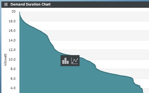
Clicking on the trend will open up a smart chart drilldown menu. Clicking on the graph type will open up a new column or line chart in a Dual Axis viewlet of that trend.
If there are rolled up trends being shown in the Ranking Chart, the user can drill down into the trend hierarchy instead of always drilling down into the time range like above. This feature can only be used with rolled up trends (ones created in PersicopeConfig using the "rollup" feature). When clicked it presents additional options to further drill into the data. The new options are:
- Stacked Column: Creates a new column chart with stacked columns.
- Multi-Line - Creates a new Line Chart.
Demand Duration Configuration
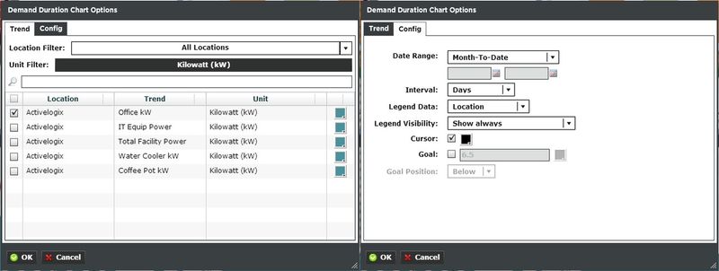
Trends:
You can select a trend by filtering Locations or Units, or both. Additionally you can start typing in the trend name in the search box to narrow down the search field. The Units are dictated by the global properties inside Periscope Config. If you don't like the default color, you can change it via the color boxes on the far right.
Options:
- Date Range: Select the time span shown for the selected trends. Selecting 'Time Range' will allow for using the calendar boxes below.
- Interval: The X axis values, represented in minutes, hours, or days.
- Legend Data: Show the Location, Trend, or both labels on the top right of the viewlet.
- Legend Visibility: Show always, never, or only when the viewlet is maximized.
- Cursor: When this is checked, the cursor will draw a line across the viewlet when the user mouses over it showing the current value of the trend.
- Goal: When this is checked, the user can enter a value that will draw a target line that the user will want to try to stay under.
- Goal Position: The line is either drawn above or below the graph.