High-Low-Average Viewlet
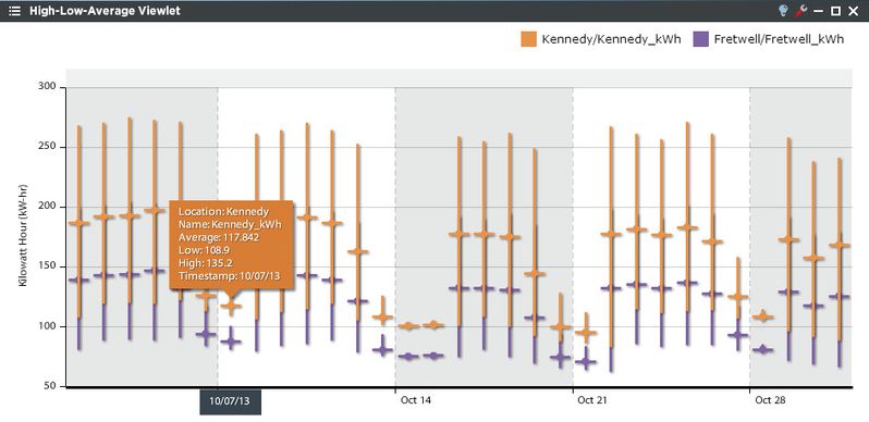
The High-Low-Average Viewlet is a useful tool to chart and compare the range and average of one or more concurrent “historized” variables in the system. Similar to a stock “High-Low-Close” presentation, the High-Low-Average viewlet shows the extremes of the variable’s values for the selected time frame and desired sample period (rollup). The built-in chart tools enable zooming into specific timeframes within the overall plot range. The chart may be plotted in either Landscape (default) or Portrait modes using the “rotate” flag in the viewlet config dialog.
High-Low-Average Configuration
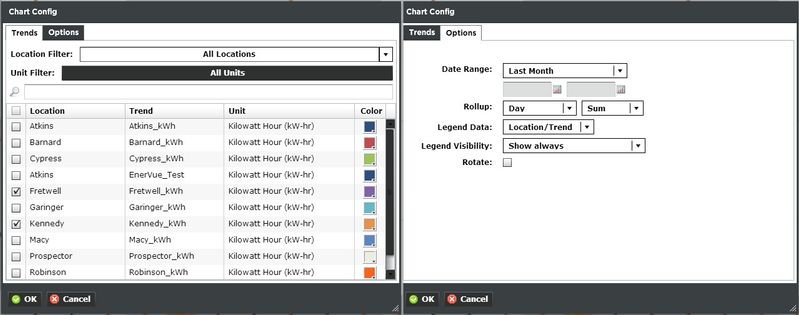
Trends:
You can select multiple trends by filtering Locations or Units, or both. Additionally you can start typing in the trend name in the search box to narrow down the search field. The Units are dictated by the global properties inside Periscope Config If you don't like the default color, you can change it via the color boxes on the far right.
Options:
- Date Range: Select the time span shown for the selected trend. Selecting 'Time Range' will allow for using the calendar boxes below.
- Rollup: Select Avg, Min, Max, Sum values of the trend based on selected date ranges.
- Legend Data: Show the Location, Trend, or both labels on the top left of the viewlet.
- Legend Visibility: Show always, never, or only when the viewlet is maximized.
- Rotate: Rotates the graph 90° clockwise.