Pie Chart Viewlet
The Pie Chart Viewlet presents a typical pie chart that the user can set up with a variety of comparable values. This is a type of presentation graphic in which percentage values are represented as proportionally-sized slices of a pie. The Pie Chart is useful for making quick comparisons, and discovering the percentage of each variable compared to the whole. A typical example would be to view sub-metered loads within a building, i.e. lighting, HVAC, and plug energy loads.
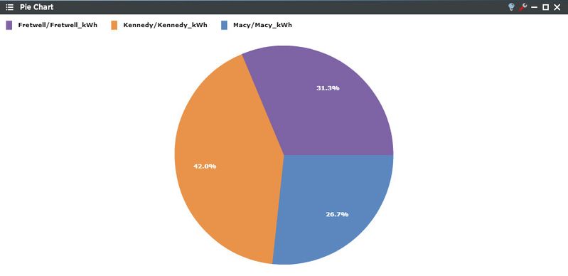
This example shows a standard Pie Chart Viewlet with sections representing kWh percentages. The user can easily identify which locations accounted for the largest portion of energy consumption for a period of time.
Smart Chart Drilldown
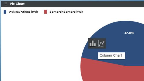
Clicking on the trend will open up a smart chart drilldown menu. Clicking on the graph type will open up a new column or line chart in a Dual Axis viewlet of that trend.
If there are rolled up trends being shown in the Ranking Chart, the user can drill down into the trend hierarchy instead of always drilling down into the time range like above. This feature can only be used with rolled up trends (ones created in PersicopeConfig using the "rollup" feature). When clicked it presents additional options to further drill into the data. The new options are:
- Stacked Column: Creates a new column chart with stacked columns.
- Multi-Line - Creates a new Line Chart.
Pie Chart Configuration
The Pie Chart Viewlet can be configured to compare similar locations to one another of a user selected time period. The location’s segments can be labeled with either their individual values or their percentage of the whole. Rollup can also be set to display averages, minimums, maximums, or sums of the desired unit.
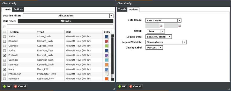
Trends:
You can select multiple trends by filtering Locations or Units, or both. Additionally you can start typing in the trend name in the search box to narrow down the search field. The Units are dictated by the global properties inside Periscope Config. Corresponding color selection helps avoid confusion when displaying numerous locations on one graph. If you don't like the default color, you can change it via the color boxes on the far right.
Options:
- Date Range: Select the time span shown for the selected trends. Selecting 'Time Range' will allow for using the calendar boxes below.
- Rollup: Select Avg, Min, Max, Sum values of trends based on selected date ranges.
- Legend Data: Show the Location, Trend, or both labels on the top right of the viewlet.
- Legend Visibility: Show always, never, or only when the viewlet is maximized.
- Display Label: Set the label to be shown as a percentage or a value.