History Line Chart Viewlet
The History Line Chart Viewlet is used to plot values for multiple similar variables over time. For each interval over the selected time period, the Viewlet can plot the maximum, minimum, average, or sum of the variable. One of the most informative history viewlets, the peaks and valleys seen in a History Line Chart can give the user an instant view of energy consumption and efficiency over time. The user also has the ability to manually drag a marquee over a section of the line or lines to zoom in and view any particular range, and then use the horizontal pan bar along the top of the viewlet to scroll across the line.
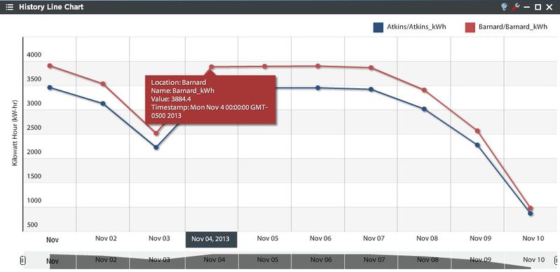
This example shows kWh trends from two locations over a specific time period.
History Line Chart Configuration
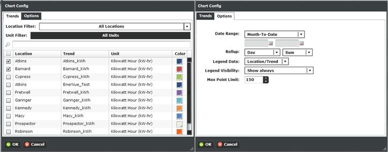
Trends:
You can select multiple trends by filtering Locations or Units, or both. Additionally you can start typing in the trend name in the search box to narrow down the search field. The Units are dictated by the global properties inside Periscope Config. Corresponding color selection helps avoid confusion when displaying numerous locations on one graph. If you don't like the default color, you can change it via the color boxes on the far right.
Options:
- Date Range: Select the time span shown for the selected trends. Selecting 'Time Range' will allow for using the calendar boxes below.
- Rollup: Select Avg, Min, Max, Sum values of trends based on selected date ranges.
- Legend Data: Show the Location, Trend, or both labels on the top right of the viewlet.
- Legend Visibility: Show always, never, or only when the viewlet is maximized.
- Max Point Limit: The total number of points that will be displayed on the graph at any given time.