Column Chart Viewlet
The Column Chart Viewlet can be used to plot the aggregate or relative value for multiple variables over time. For each rollup interval over the selected time period, the Column Chart can plot the maximum, minimum, average, or sum of the variable. The Column Chart Viewlet is a useful tool for presenting historical data in a variety of ways, for instance, comparing locations against each other or aggregating sub-meters in a building. Viewlet functionality allows the user to manually drag a marquee over a selection of columns to zoom in to view any particular section of the graph, and then use the horizontal pan bar along the top of the viewlet to scroll through the columns. Selecting “show all” will revert back to displaying the entire time range indicated in the configuration menu.
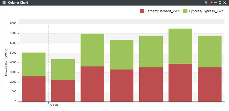
The Column Chart Viewlet can present information from multiple locations in either a stacked or clustered display (stacked shown).
Column Chart Configuration
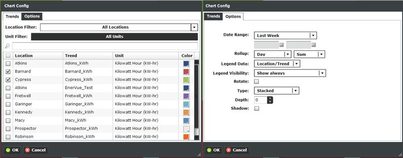
Trends:
You can select multiple trends by filtering Locations or Units, or both. Additionally you can start typing in the trend name in the search box to narrow down the search field. The Units are dictated by the global properties inside Periscope Config. Corresponding color selection helps avoid confusion when displaying numerous locations on one graph. If you don't like the default color, you can change it via the color boxes on the far right.
Options:
- Date Range: Select the time span shown for the selected trends. Selecting 'Time Range' will allow for using the calendar boxes below.
- Rollup: Select Avg, Min, Max, Sum values of trends based on selected date ranges.
- Legend Data: Show the Location, Trend, or both labels on the top right of the viewlet.
- Legend Visibility: Show always, never, or only when the viewlet is maximized.
- Rotate: Allows the user to turn the graph 90° clockwise.
- Type: Set the graph as stacked, clustered, or stacked 100% (shows percentage ratio of each trend that adds to 100%)
- Depth: Adds the illusion of depth to the bar graph.
- Shadow: Makes the graph appear to stand out from the background with a drop shadow.