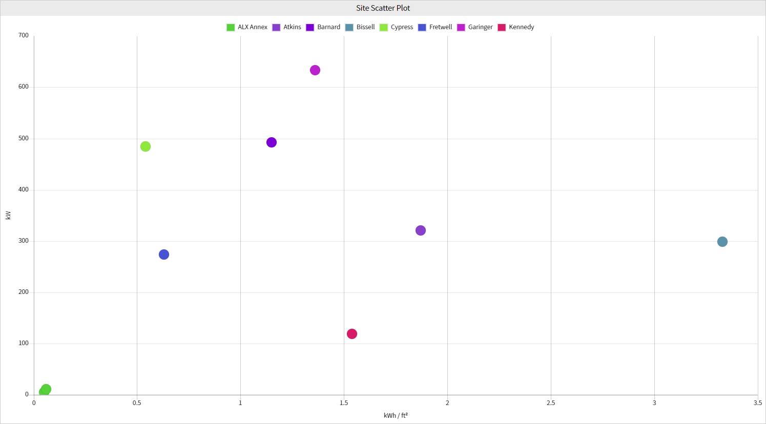
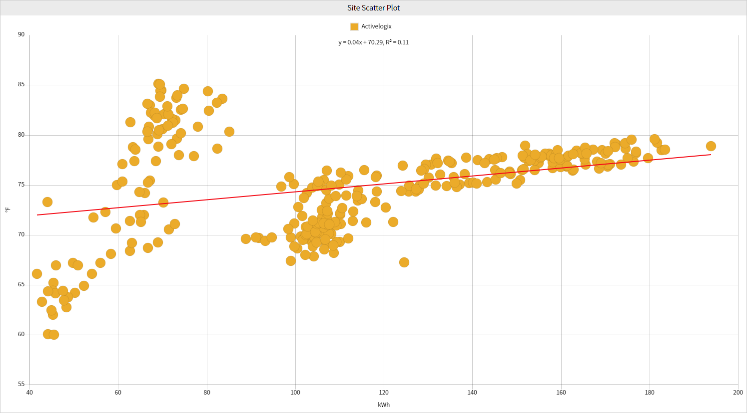
Site Scatter Plot
The Site Scatter Plot displays trend data points on an x and y-axis. This visualization enables easy display of relationships between two variables and how they change over time. Data regression line(s) can show the correlation values as a line of best fit between the two variables.
Configuration
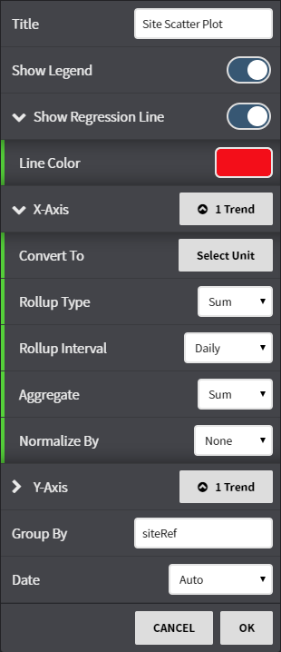
Configuration Options:
Title: Set a custom viewlet title.
- Show Legend: Toggle the legend on or off.
Show Regression Line: Toggle the display of a line of best fit and choose the color of the line.
- X-axis: Select from available trends using either the Picker or Query mode for the X-axis. Rollup, Interval, Aggregate and Normalization options can be set per axis.
- Y-axis: Select from available trends using either the Picker or Query mode for the Y-axis. Rollup, Interval, Aggregate and Normalization options can be set per axis.
- Group By: Choose groupings for the trends selected by points or Refs.
- Date: Fine tune when the trend's data is shown. Can be set to auto (global control), a preset date range, or a user selected date range.
This feature requires the part number PER-ANALYTIC