Pie Chart
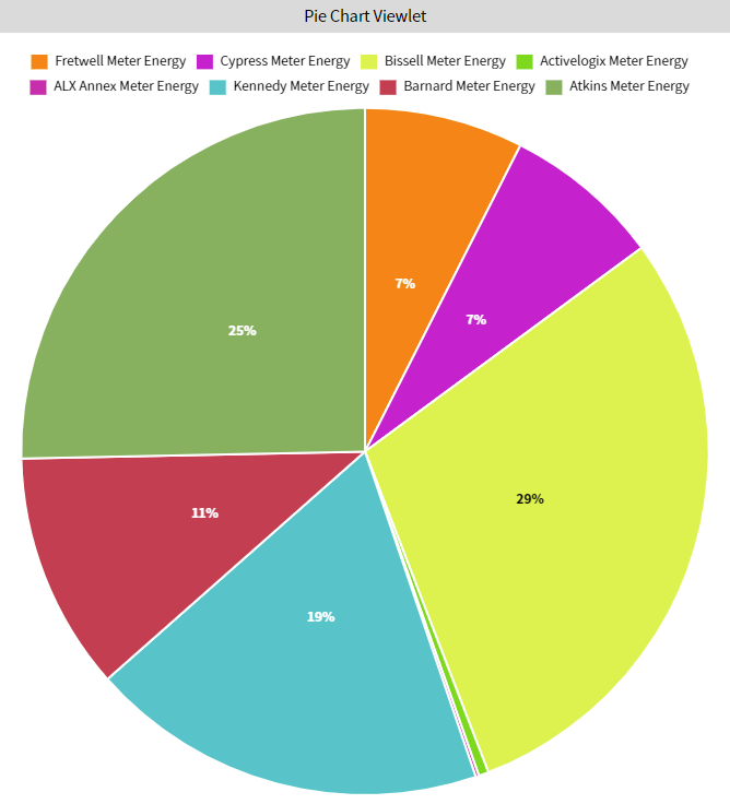
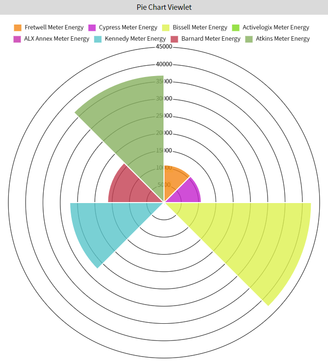
The Pie Chart viewlet can be used to show the relative value of multiple variables over time. For each interval over the selected time period, the viewlet can plot the Max, Min, Average, or Sum of the variable. This particular viewlet can be displayed in a standard pie, a doughnut, or a polar area chart. 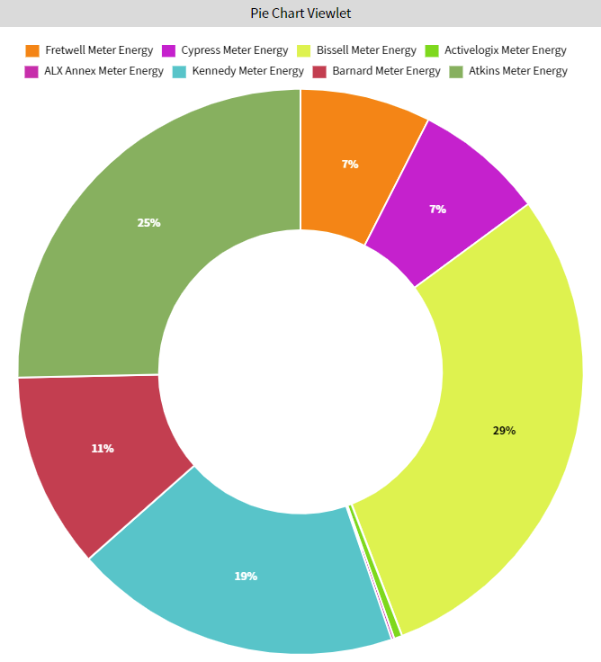
Configuration
Configuration Options
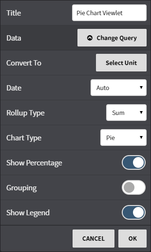
Title: Set a custom viewlet title.
- Data: Select from available trends using either the Picker or Query mode.
- Convert To: Convert the data to comparable units such as kWh to MWh or kWh to BTUs.
- Date: Fine tune when the trend's data is shown. Can be set to auto (global control), a preset date range, or a user selected date range.
- Rollup Type: Select auto, or manual for more rollup control over rollup time, and rollup types such as Avg, Min, Max, Sum values of the trend based on selected date ranges.
- Chart Type: Select the format the data is displayed as either a Pie, Doughnut, or Polar Area (displayed).
- Show Percentage: Display the percentage of the whole on the chart.
- Grouping: Enable the grouping feature. This feature groups the trends displayed in the chart by shared tags or Refs.
- Show Legend: Toggle the legend on or off.
This feature requires the part number PER-ENERGY