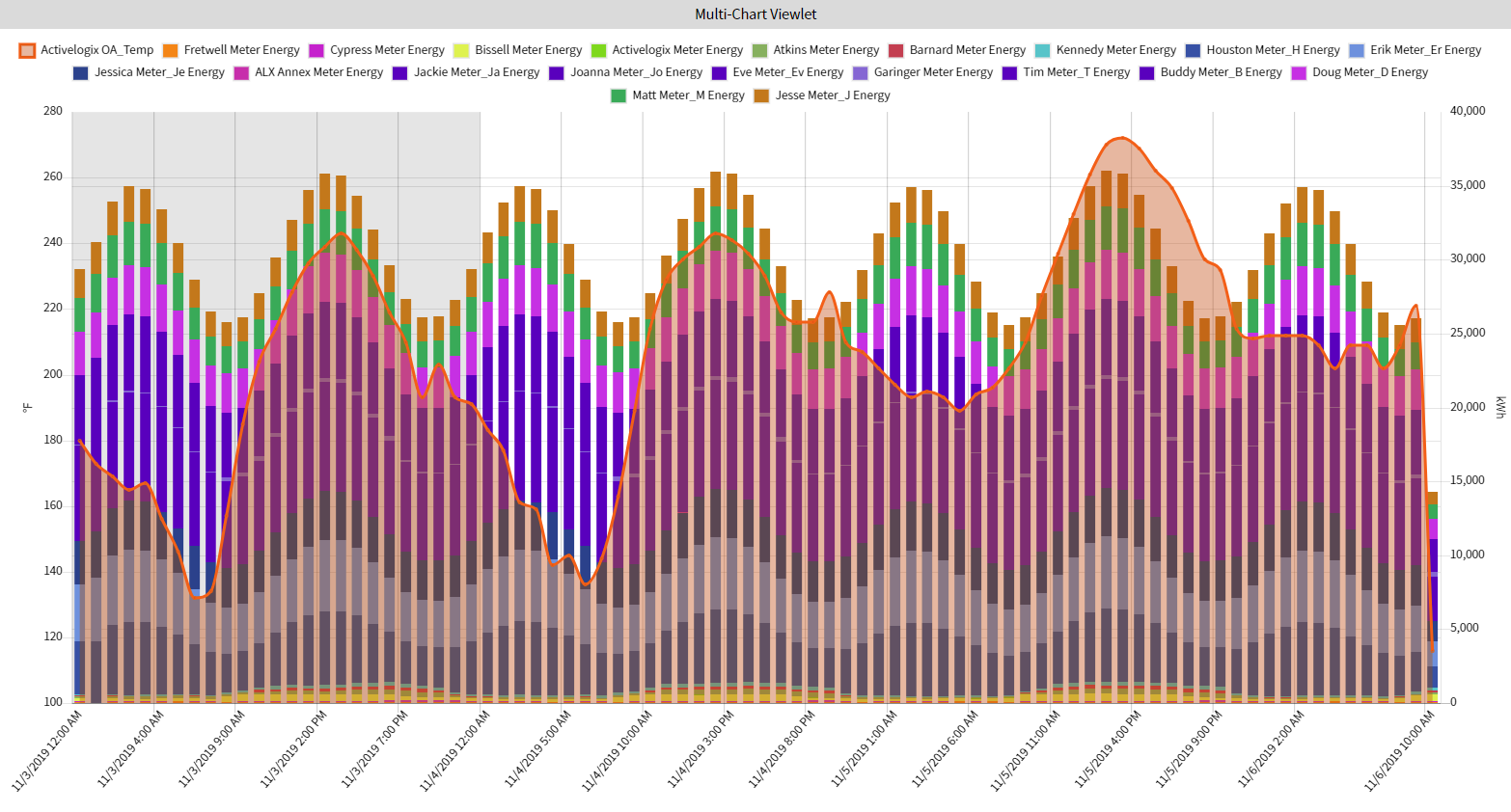
Multi Chart
The Multi Chart viewlet can be used to plot the aggregate or relative value for multiple variables over time. For each interval over the selected time period, the viewlet can plot the Max, Min, Average, or Sum of the variable.
Configuration
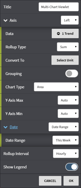
Configuration Options:
- Title: Set a custom viewlet title
- Axis: Select the Left or Right axis. This control also expands to allow for independent control of each axis
- Enabled (Right axis only): Choose whether to display the right axis. This is shown when the right axis drop-down is selected.
- Data: The familiar data picker use to select trends or points for each axis
- Rollup Type: Avg, Min, Max, Sum, or Count the values of trends based on selected date range
- Convert To: Used Convert data to comparable units, such as kWh to MWh or kWh to BTU's
- Chart Type: Select the method that data is visualized. Select from Area, Area Stacked, Bar, Bar Stacked, Line, Step Area, Step Area Stacked, or Step Line. Different methods of visualization can convey data differently.
- Date: Fine tune when the trend's data is shown. Can be set to auto (global control), a preset date range, or a user selected date range
- Rollup Interval: Determine how frequently you would like the summarized data to be displayed.
- Show Legend: Toggle the legend on or off.