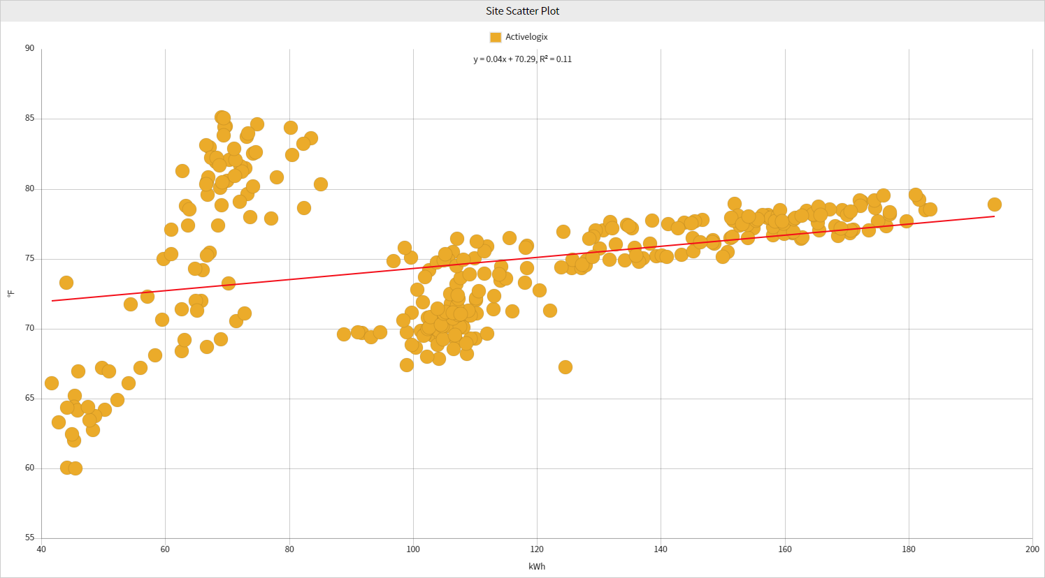
The Site Scatter Plot displays trend data points on an x and y-axis. This visualization enables easy visualization of relationship display of relationships between two variables and how they change over time. Data regression line(s) can show the correlation values as a line of best fit between the two variables.

Configuration

Configuration Options:
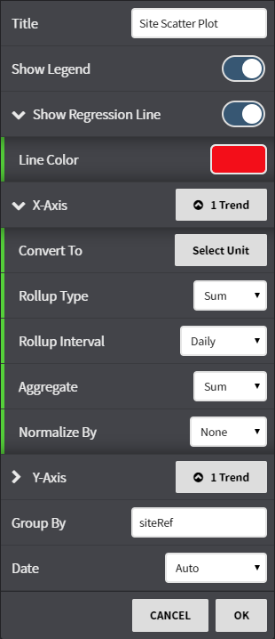
Title: Set a custom viewlet title.Trend
- Show Legend: Select the Trend to be used on the X and Y axis. Data Toggle the legend on or off.
Show Regression Line: Toggle the display of a line of best fit and choose the color of the line.
- X-axis: Select from available trends using either the Picker or Query mode for the X-axis. Rollup Type: Select Avg, Min, Max, Sum values of trends based on selected date ranges.
- Convert To: Convert the data to comparable units such as kWh to MWh or kWh to BTU's.
- Normalize By: Normalization averages data such as energy consumption based upon common units of measurement such as square footage. Select between None or Site AreaInterval, Aggregate and Normalization options can be set per axis.
- Y-axis: Select from available trends using either the Picker or Query mode for the Y-axis. Rollup, Interval, Aggregate and Normalization options can be set per axis.
- Group By: Choose groupings for the trends selected by points or Refs.
- Date: Fine tune when the trend's data is shown. Can be set to auto (global control), a preset date range, or a user selected date range.
...